About my cover art.
Every album I release captures elements of where I am in my life and career.
From my first album to my latest, the elements in the cover designs reflect the people, souls and things I love.
I’m grateful to have worked with wonderful artists, photographers, and friends to create, collaborate, and celebrate these projects. Here’s some insight into how Paul K. Ward, of StudioBlue Productions, put together my latest cover. (I’ve used Mr. Ward’s talents on all of my albums so far - 3 full albums, 3 singles, and 6 digital releases. And you know there are more stories to tell!)
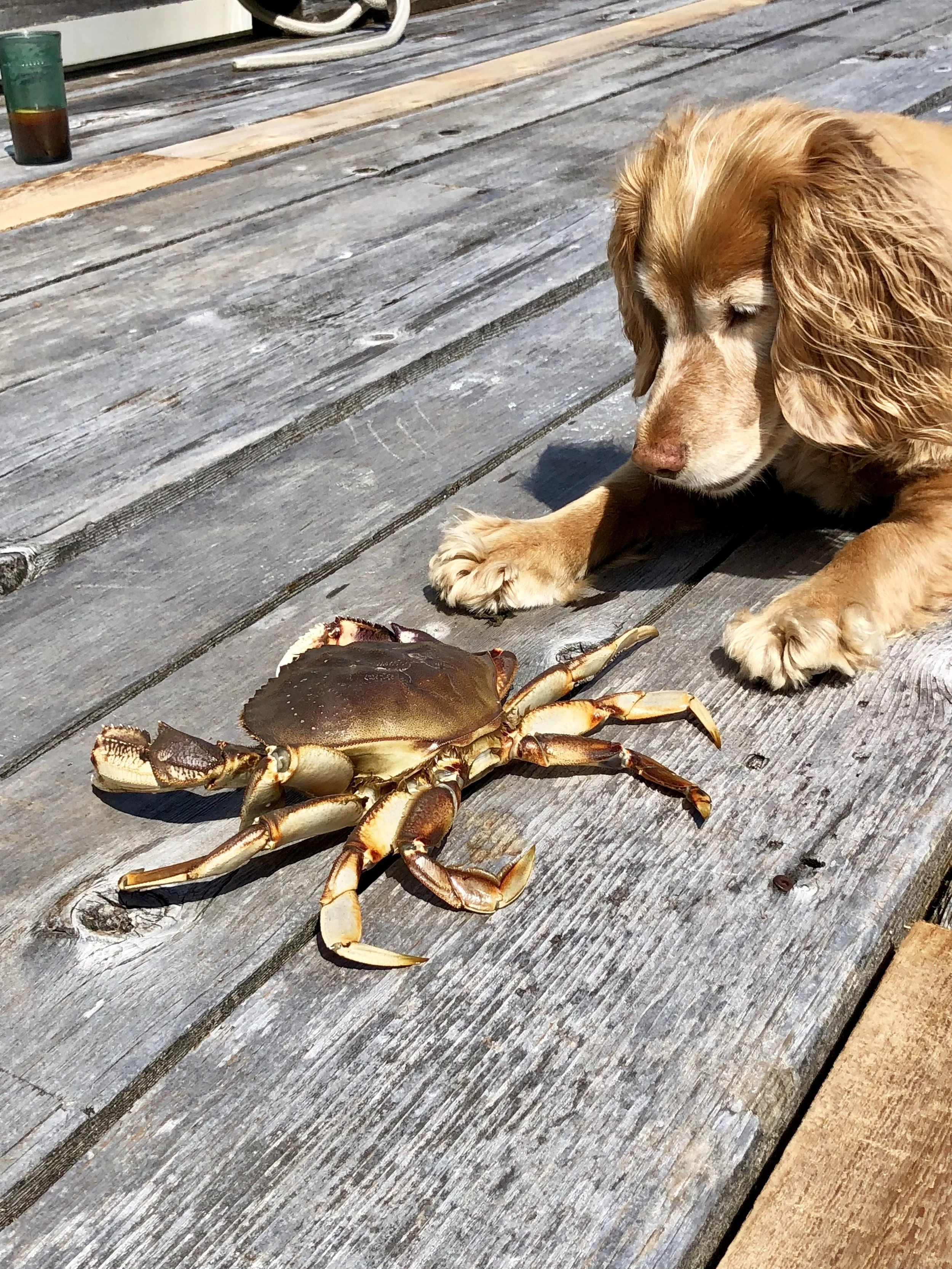
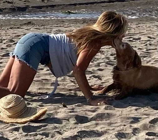
I’m especially grateful Paul was able to integrate into his artwork my beloved Maggie, my stalwart four-legged angel who kept me grounded and healthy for over 16 years. I miss your physical presence Maggie, but your spirit lives eternal with every beat of my heart and breath that I take!


The front cover captures my great loves, and adds some surprises.
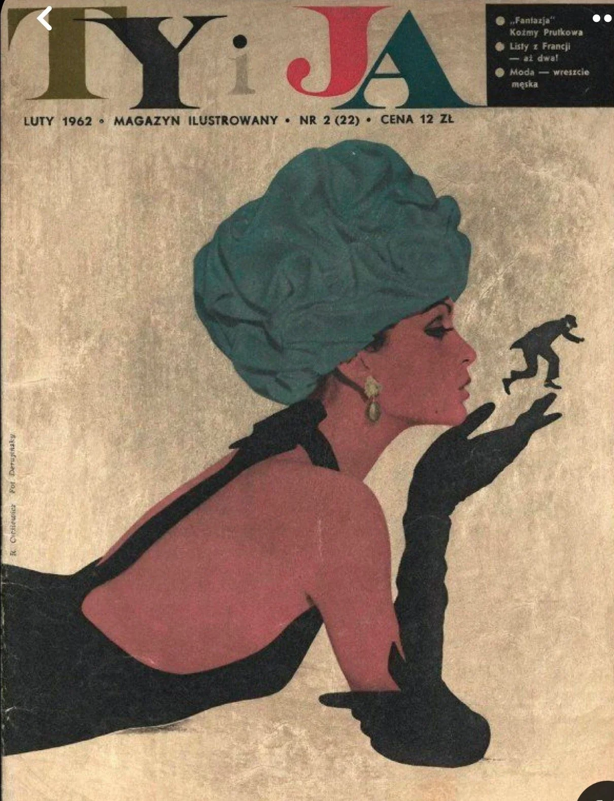
When I gave Paul guidance, I offered some sample art of vintage magazines from the 1950s. We agreed that it captured a new texture for me, and also an era where jazz, beautiful women full of charm, and “cool” came together. He took it from there, maintaining palettes and text treatments but incorporating signs, symbols, and clip art that have so many layers. Here’s how he tells the story.
Billie: This is really different than past covers, how did you come up with this? Can you explain how that brilliant creative brain of yours works? Your inspirations, key elements, anything?
Paul: I’ve been lucky enough to design your album art since your debut Crazy He Calls Me dropped. Past designs targeted an elegant design, inspired by the beautiful portrait photography you created with great photographers in the area, and at that time I knew your brand-building phase was in full swing. Working with you to design your website gave me insight into key elements that were authentic to you while also elevating your growing audience’s expectations.
To do this one, we talked a little bit about vibe and you sent over some samples. It struck me in our conversations that we were headed down two new paths that were deeply personal for you, and reflected your own journey into jazz as a key element of America’s textured past.
The sample you sent definitely had a foot in our past experiences together - clip art from a 1950s book showed part of a reclining woman with a hat, with a palette and texture that evoked some of the great album covers of the 1950s and 1960s. Having grown up in a family that devoured the monthly magazine, Art in America, I knew a lot about the visual language of that era.
Also, in all of our covers, we’ve snuck in symbolism and juxtaposed elements to evoke romance. This is something I felt we could do in the new design.
But most importantly, I noted in our conversations your interest in including biographical elements very specific to your personal, not just professional, journey over the last couple of years.
To put all these together, I started with a palette, a texture, and a “clip art” approach with strong call-back to the 1950s commercial design era. There were two reasons: The jazz vibe of the time; and the imaginative use in commercial art of elements from Miro, Picasso, Matisse, and other European artists.
Having a jazz vibe was important. Jazz in that era was developing a very specific, small-group sound — a musical “texture”, if you will — that was higher-energy, but also had more sultry and romantic elements. So much of the jazz music of that time featured heart-breaking ballads, small-ensemble virtuosity, and cocktail-era lifestyle. The fonts and textures evoke that era. Just as importantly, you have always put together great backup bands. You rely on their professionalism, taste, and culture to raise the bar in your performances. And these people have positively shaped your tastes, skills, and love of the music. Featuring instrument clip art made sense.
You provided a photo of yourself in profile with a plant behind you, in a stylized format that inspired other clip art. The plant behind you reminded me of Matisse cut-outs — a perfect fit. Other artists such as Miro and Kandinsky also used design elements that influenced me.
Also, your story over the last four or five years featured your relationship with love, especially in the example of your beloved pet, Maggie, a field bred English cocker spaniel of golden coat and even more golden heart. We both agreed that, among the instrument cut-outs, we should find a way to incorporate Maggie (who just left this world). She represented absolute and unconditional love, and her example in your life has centered you.
The result of trying to tell your story was a collection of clip art that had to become cohesive, and also that needed to draw the eye around the cover in a soft way. I created regions on the front cover that were sized and colored to create eye rests on your portrait, the album title, and the personnel. The other clip art elements were placed for further exploration, with a “softer” invitation by making those elements smaller, often partially transparent, and within a limited and complementary palette evocative of the 1950s. Some elements are obvious — clip-art of a woman with a cocker spaniel is small, but laid out to show their connection. This is you and Maggie. Other elements can be decoded by people who know you, or are simply mysteries that keep people engaged in deciphering the design. Who’s the man spelunking down the album title? In a way, it doesn’t matter. It’s a universal theme of the romance of exploration, and the exploration of romance.
Lastly, a note on the typography. I downloaded and experimented with a lot of fonts. The goal was to choose fonts that evoked the 1950s and 1960s, and to vary the fonts just enough to create a “character” for different pieces of information (CD title, personnel, your name, song credits), while not having the variety of fonts be too busy.
All together, these design choices I think are fresh and yet evocative of the textures of that period in jazz, and are also — like the Da Vinci Code — aspects of a greater story with mysteries and surprises. All of these are relevant to your inner life and your actual life. They’re also relatable to anyone. Romance, the love of a loyal pup, the joy of connecting to creative musicians who support your journey, the art of living and the hope for more, and better, loving.
What I hope is that people view the CD art as an invitation to explore the music, the genre, and their own stories. Love, music, and the story, especially, of your falling in love all over again with jazz.
Billie: Yes, Paul! My “falling in love all over [and over] again with jazz” and all that it represents to me. As I am convinced that it is this music being played in real time, that truly brings out the very best parts of humanity. Thank you for being a part of my music. And sharing your many talents with ALL OF US! What a wonderful gift.